|
Challenge Your Creativity Challenges
Visit the Challenge Your Creativity
forum on the PIRC Bulletin Board
All challenge ideas and instructions from the forum moderator,
Dez Pain, also known as xymonau. (Used with permission.)
Here is a link to Dez's personal site: p216.ezboard.com/bpeoplebuilders
Return to site menu
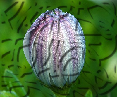
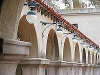
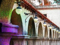
| May 8 - Itchy and Scratchy
For something a little different, this week we will use another of the retouch tools - Remove Scratch. Only, we won't be removing any scratches!
In order to mess with this tool, and see what it can do, I want you to choose a nice image. Using the level at 100%, soft edge 50, and a large sized brush, click on Mode, and start running the brush over your image. Watch how the colours change, and the image becomes a different colour. Keep painting until you've covered as much of your image as you wish. Now, use a merge mode - I think on mine I used difference - and adjust your transparency, and merge. You may have other twists to this, and if you have something else unusual that we can try with this tool, please show us.
| before
 |
after
 |
|
| April 24 - Rotate in Virtual 3D
No fancy names this week, and this is a tool we're re-visiting, because so many new faces have popped in here recently. Otherwise known as the trackball, this tool will work only on path objects. You can change a photo to a path object under - strangely - "Object". When you click on the transform tool, you will then see the trackball option in the tool panel under "Rotate Method". It's the last option. I want you to mess about with perspectives for your image, and post your favourite result here. You may use photographs, path shapes, clip art, paintings, or a combination. The idea is to come up with something creative and unique. This is such a helpful tool, and I hope you get to know it better this week. 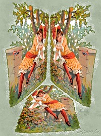
|
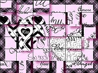
| April Challenge - create embroidery
This one didn't quite turn out like embroidery...
more like a stencil I think!
|
| April 10 - If Big Things Were Little
|
| March 27 - "The Shades"
This week, let's do a variation on an old technique. Open a blank canvas. Using your paintbrush at any size, and in mode. draw some wild squiggles all over the canvas. Edit/fill/fit the image - fill the squiggles with an image. While selected, add a shadow. If the squiggles are wide, then make a larger shadow. If fine, narrow the shadow. Experiment with altering the transparency and soft edge of the shadow. De-select, and fill the background with the same image. Merge all. |
 |
The second method is to paint in mode, but select a texture - lacy is good - for the paint. Fill as above, with a smaller shadow, then merge with the filled background as above. This will give you a great texture. Use your Format/Adjust tools to nicely finish your images. |
|
|
| March 6 - Up the Garden Path using path shapes

|
| Feb 27 - Signs and Designs
This week, we will be using path shapes, photographs and fonts to create a commercial design suitable for a sign, billboard, or magazine advertisement. This gives you a lot of scope, since you can be advertising just about anything. There's one limitation, however. The brand name is "PhotoImpact"! LOL So, PhotoImpact cookies, cars, health resorts - you name it - as long as the name is PhotoImpact. 
|
| Feb 20 - Button Up!
creating antique buttons
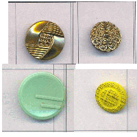
The original buttons I tried to copy...
|
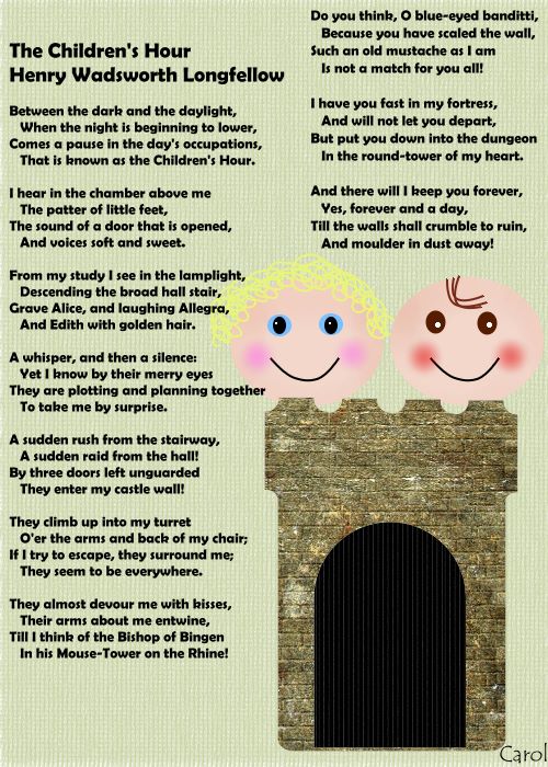
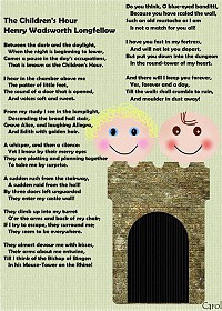
| Feb 13 - What Does It Mean...
A truly creative task this week, with an international flavour.
I want everyone to select a poem written by one of their countrymen, and illustrate it in some way. You might use a few lines, or the whole thing. It does not need to be a font play, but please add the poem to your post so we can enjoy it.
I know in some smaller countries there may not be many well-known poets. If this is the case for you, please select a poem from elsewhere that speaks to your heart.
These don't have to reflect the local culture, but it might be nice if they can. We learn so much from each other.
You may use photos, painting, path shapes, or a combination. You may post as many images as you wish. I know I have many favourite Australian poets. A Google search for poetry or poems will give you more free poetry sites than you can cope with. Above all, enjoy the sheer creativity of making a personal work of art.
|
| Feb 6 - Make 'Em and Break 'Em
A predictable challenge this week, then an opportunity to be really creative. Or destructive.
Make 'Em:
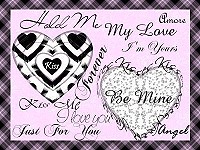
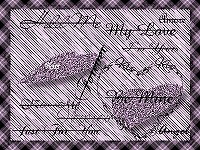
Make a Valentine's Day card, background, or wrapping paper, but you must use at least two different things found in PI. For example, path shapes and text, painting and format tools, photo and PI filter. Make it pretty, elegant, funny, but make it really well.
Break 'Em:
Now take your image, and using grids or selections or crops or extract object, etc, plus shadow effects, chop the image up! This is the learning part, and be creative with the way you wreck your image. I don't want to give instructions unless you're really desperate for ideas. I used a very simple method with grid and partition. Maybe you want to tear the card up! LOL The aim is to give the result a 3D feel.
Post both images, before and after.
|
Make 'Em
|
Break 'Em 1
|
Break 'Em 2
|
|
| Jan 30 - Z Merge Enamelling
This week, we will use the z-merge tool to make an effect that looks a little like the enamelling that is fired and melted in a kiln. I know there are plenty of people here who can make better examples than mine, so I can't wait to see your results.
Here is a brief guideline:
Open a new canvas.
Select Path Outline Drawing tool.
Choose your first colour (or gradient, etc) and select 3D.
Click on Material, then go to Bevel settings. In the Maximum width box, choose the width you want. You might have to experiment a bit, depending on whether you want to make a frame or a shape. When you are satisfied with the width, and have selected any other things like Bump, etc, click OK.
Now select your shape. If you haven't done this before, opt for a circle or a square to get the hang of it.
Click on Panel, then Outline, and select the top - unbroken - outline.
Draw your shape.
1. Duplicate.
2. Change the colour. (This new shape is covering the first.)
3. Go back to Panel, Outline, and select another style of line. (Try the bottom one.)
Now you have a two tone shape.
Repeat 1, 2 and 3 another few times, each time choosing a new colour and a new outline style.
Now, click on Layer Manager.
Select the top image, click on the z-merge icon, and tick the box next to "z-merge" in the top bar. Select the second, third, etc and do the same for each. Since the shapes are all at zero level, the colours will blend. Adjust the levels to make a colour dominant if you wish.
Select all objects, merge as single object.
You can make rainbow flowers, picture frames, jewellery. Use metallics or textures for a different look.
|
| Jan 16 - Glass People
I love the glass effect, and I know others do, too. This week, I want you to turn a photo or clip art of a person into glass. I know lots of people know how to do this, but for the newer folk, here is a very rough description of what to do.
1. Open an image - needs to be one you don't have to adjust the size on later, as this spoils the effect. Keep the image inside its frame.
2.Open a New Image (blank canvas), the exact size of the first. At this point, as long as you remember the name of the image, you may close it, because you now work on only the blank canvas.
3. Go to Edit/Copy, then Edit/Paste/As Object. Instead of this, you can Select All/Convert to Object, if you prefer. The aim is to make the blank canvas an object.
4. Go to Object/Convert Object Type/From Text/Image to Path.
5. Click on the Path Image icon, and the Path bar at the top of the page will come up. Select 3D Round (although the next one works, too), and when the image defaults to a 3D size, in the Path Panel box that pops up choose 1 for border and 1 for depth. Changing these sizes doesn't have much of an effect, in my experience. Close this box.
6. Now go to the Material icon, hit Bump, and click in the box next to "Bump Map", and your files should open. Scroll through and select the original image, and open it. The image will appear as the bump map. Make Density 100%. Click OK. Don't be tempted to do all the steps (e.g. don't do the reflection map until you've closed the window on this.) at once, or the image might not turn out properly. If you prefer the look of it inverted, you can select that option before clicking OK, but often leaving it alone results in a better image.
7. Open Material again, and choose Reflection. Click in the Reflection Map box, and again scroll through your files and select the same original image. Select it, and choose Density 100 again. Click Okay. (Here is where the problem pictures show up. Doing this makes the original picure appear in the background as an enlarged, foggy thing. This looks good on some pics, but terrible on others. I get around this - but it can be a lot of work - by putting colour or a gradient on the base canvas, before the 3D effect. It can be a lot of work finding just the right picture, or gradient, but it's worth it. And that's what makes it art instead of just going through steps.)
8. Go to Material/Shading. Here, you can choose Phong or Metallic. By now, it looks like glass. Sometimes the metallic effect takes away the glassy look, and other times, it enhances it. Just experiment. There doesn't seem to be much difference between the different metals, but I recommend you choose both settings at 100%. You can also alter the light effects now, if you wish.
9. That's about it. Just Merge All, and Bob's your uncle. You will be frustrated with some pics that appear to be perfect, and others will surprise you. Good luck with your attempts!
I also want to add that you need to experiment with the Format or Adjust tools to finish your image nicely. I think we'll see some great creations here this week!
And remember - it's a person, not an object.

|
Return to top of page
©Carol (Miniviolet) 2005
|